Hello to all.
I am delighted to introduce the second part of the article “the composition of an image to the cinema” .
The reading direction of the human
Several scientific studies claim that individuals of the same culture have the same sense of reading.
Here is the meaning of reading to people with a western culture :
Thus, we scan an image quickly, forming a sort of ” Z “. This scan is like an slr without us noticing.
Skew the meaning of reading
However, this sense of reading so-called classic is not unstoppable. In fact, the human eye may be attracted by choice of composition. It is here that the painter, the photographer or the filmmaker involved.
As well, there are things that, if they are judiciously placed, attirerent the eye first.
The human eye will be instantly attracted to various shapes, bright spots or lines that you can create in your images with the help of plastic processes.
The human eye will tend to be more attracted to :
The movement in a static image
The face and the gaze
Our gaze is positioned first on the right side because we see a face.
Jean Dujardin in OSS 117 – Cairo : nest of spies by Michel Hazanavicius.
The contrasts
Cary Grant, in Death to the kits of Alfred Hitchcock.
Contrast of shapes : the instructor Hartman with his hat spring relative to the line of soldiers with shaven heads.
R. Lee Ermey in Full Metal Jacket by Stanley Kubrick.
The depth-of-field
Our gaze has the habit of asking about the characters, objects, or shapes in the foreground before turning to those of the background.
We let us first look at Russell Crowe (and not Ridley Scott ;)) before our next file at the bottom right. The counter draws a line of flight
Russell Crowe and Christian Bale, in 3h10 to Yuma by James Mangold.
A repetition of shapes or colors can also act as line of flight.
Barry Lyndon, Stanley Kubrick.
Conclusion
In the end, you can create yourself the reading direction wanted by putting the elements more or less as before to give a context and a meaning to your image.
John C. Reilly in Magnolia by Paul Thomas Anderson.
In this image, we are first attracted to the human form, and then by the cross, which has the same color as the jacket. The shadow divides the image into two, which allows emphasis to be placed on the hero and the cross. Thus, we see the importance of religion for the character.
Daniel Day-Lewis, in There will be blood by Paul Thomas Anderson.
You may notice here that the character and the fire are placed on the rows of vertical forces. The fact that we see the character of dos (and therefore not his eyes) and the color link that is created between him and the smoke of the fire, some will be evil.
Steve Buscemi in Fargo by the Coen brothers.
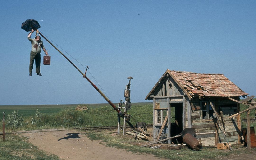
In the foreground, our gaze is directed to the character and, in particular, on its face bloodied, and the suitcase. And then, our eyes turn towards the barrier, which is another element that emerged in this empty scenery. This image makes us understand that the character lost in the middle of nowhere, find themselves in an impasse.
Note that even when the meaning of an image is a sum of several choices of staging and that the rules that you can read in this article can be countered by other processes.
I will be once more delighted to read and respond to your comments, so feel free to express yourself ;).
Go to the last part of the article : the image composition part III
Roman